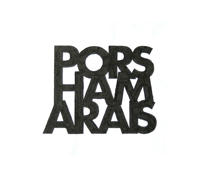
A typographical exercise in creating interesting areas of negative space using our names.
Using the typface Helvetica, I used the letters of my name to create interesting typography in which you first notice the shapes and then the letters. The biggest challange was hand-drawing the letterforms in proportion to one another!
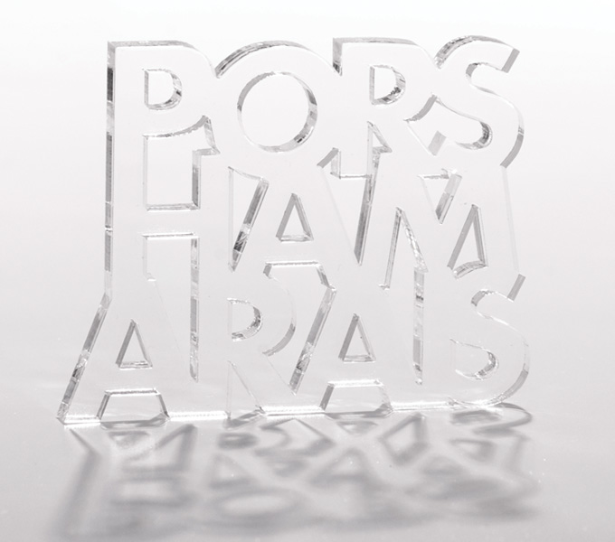
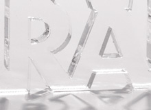
A couple of years later, I got the ham arais stack laser cut out of perspex. As well as being super cool, it showed the negative space around the letter even more as it came with all the counters and extra bits – like a little puzzle.