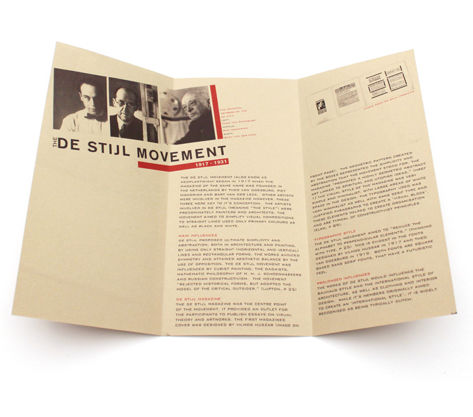
Given the task of creating a brochure to convey the typography of the 1910s, I was stumped until I stumbled upon the De Stijl movement of the Netherlands.
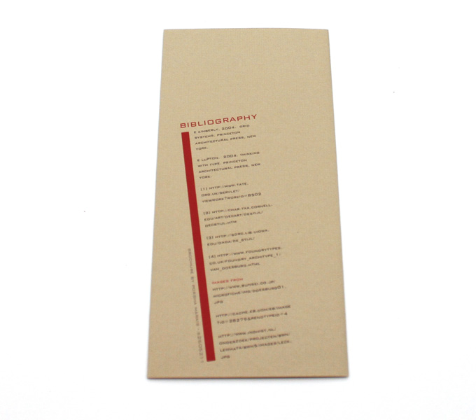
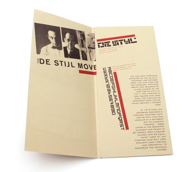
The brief was to be two colour only. So to give it the right feel, I printed on a dark beige textured paper (to give the appearance of aged paper) and printed in two colours, black and red (traditional de stijl colours), the overall effect is quite striking.
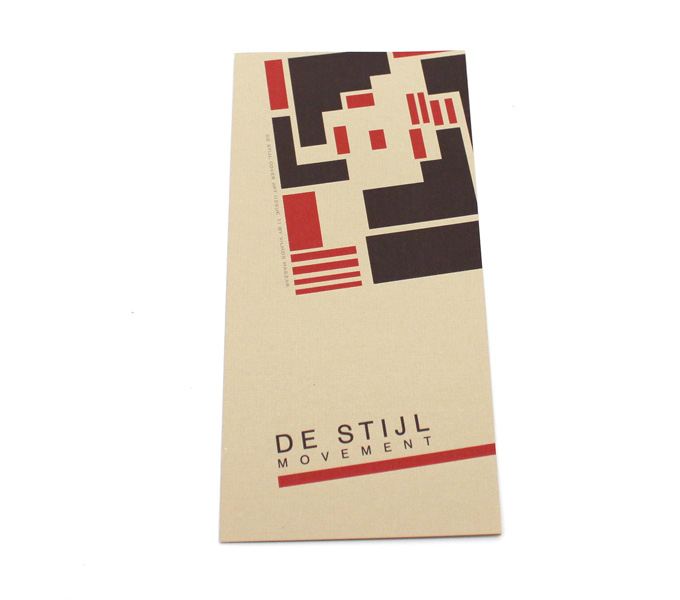
I redrew the cover illustration from an orginal de stijl magazine and recoloured it to fit with the brochure.