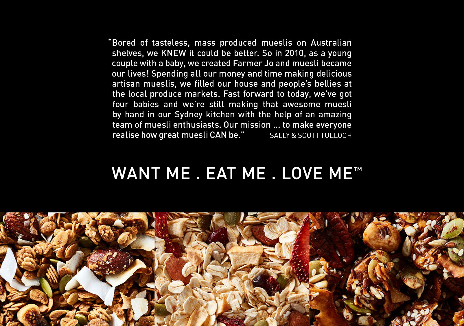
Farmer Jo is a premium australian-owned muesli brand based in Sydney. They make Granola that is basically like crack and I’d happily eat it for every meal if funds permitted. They approached me to design their new packaging and build a website, but in the process we expanded their brand elements and gave the whole thing a refresh.
BRANDING
The exisiting Farmer Jo held a soft spot in the owners hearts, they weren’t ready to let it go, so we built upon it. The logo type was tweaked slightly for kerning. The font DIN was added in as the core brand font to take over from the old logo font which used to do all the work.
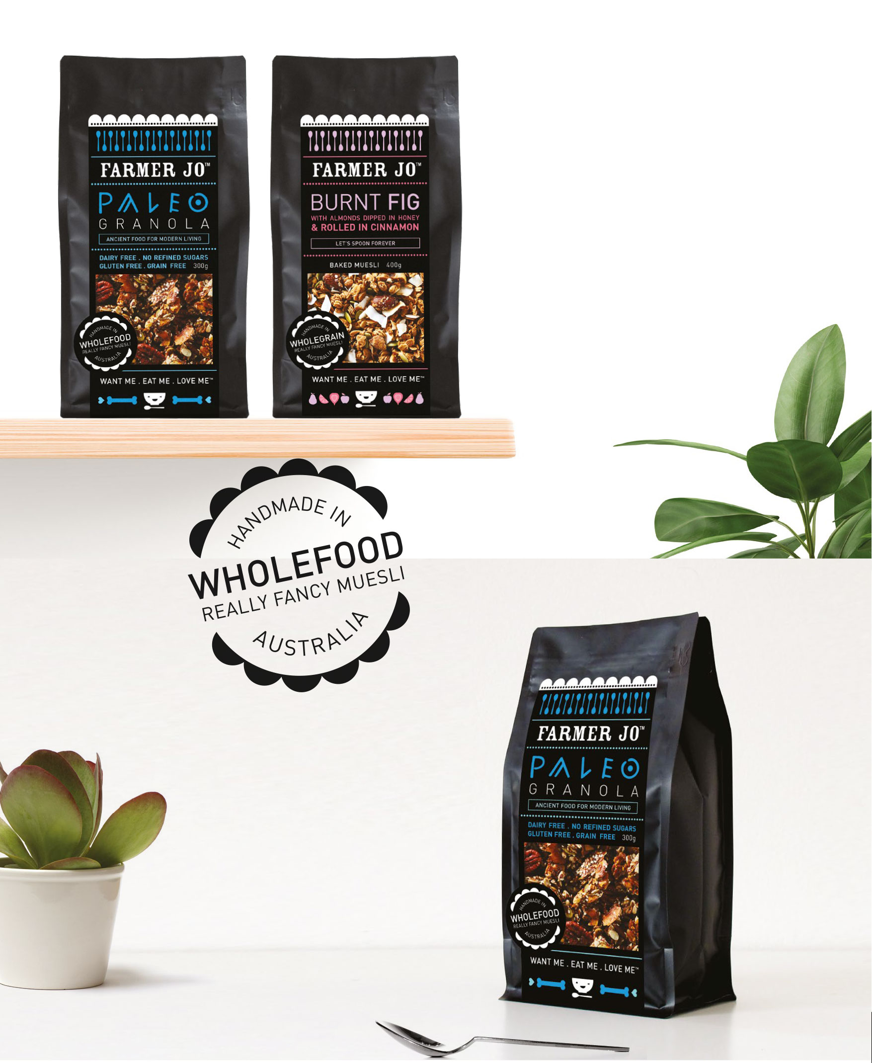
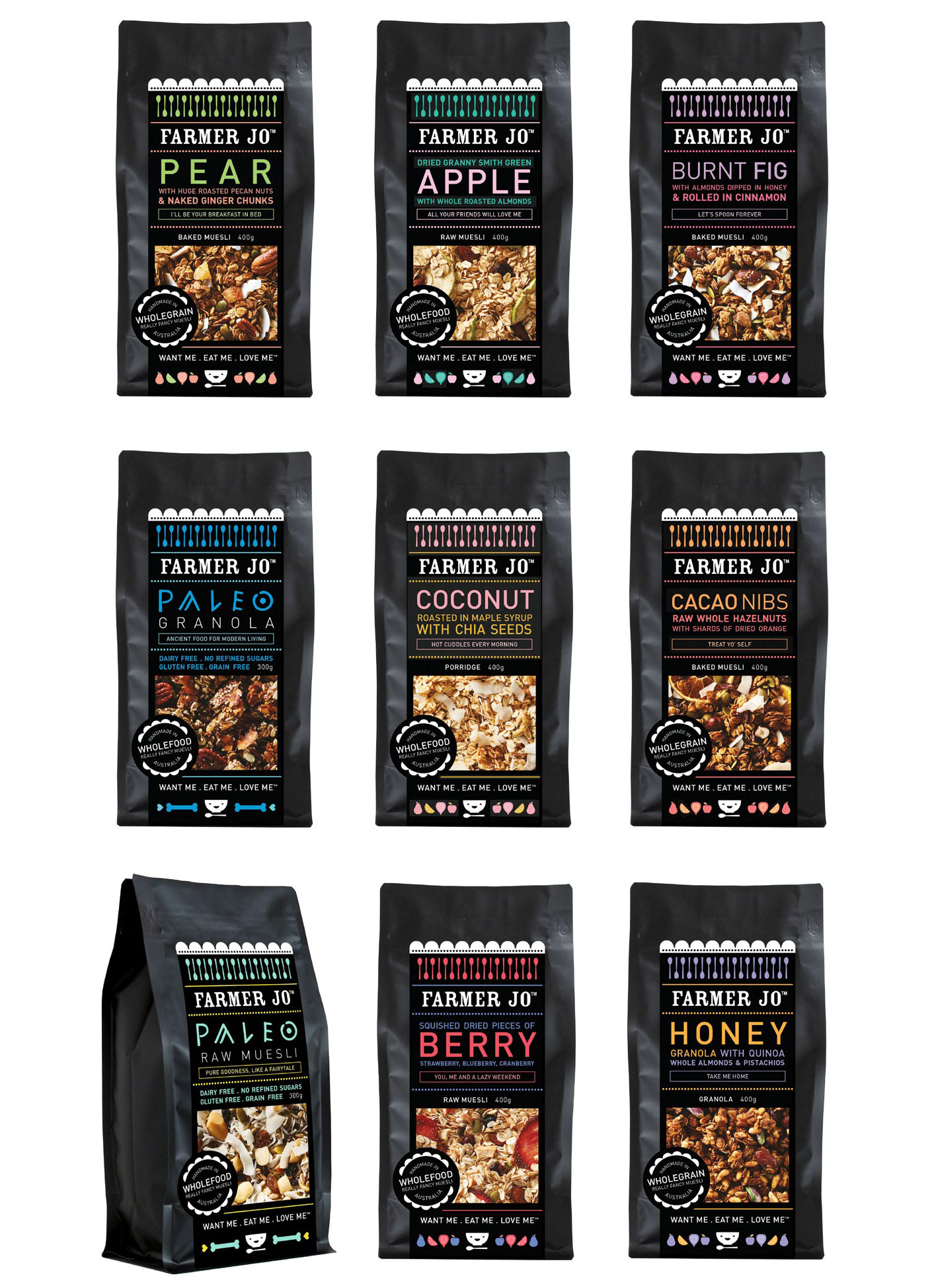
Brand elements like the scallop, dots and spoons were all refined to give the brand the premium, but also fun feel it original aimed for. A predominantly black and white colour palette mixed in with key bright colours (that represent the flavours) gives Farmer Jo its unique look.
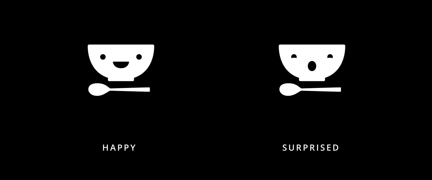
This happy brand thats all about breakfast needed a happy face, so I created a happy little bowl to bring it all together and add life. He’s happy, he’s sassy, he’s filled with the most delicious muesli you’ll ever taste.
Another critical aspect of the rebrand was breathing space. Things got smaller, white space got bigger and everything felt a lot calmer.
We didn’t want things to get too high falutin though, so with language we brought the brand back to its ‘real’ market-selling origins with taglines like “Really Fancy Muesli”.
This brand is all about contradictions syncing up to be premium, but humble; an all knowing sage of muesli, but not a snob.
PACKAGING
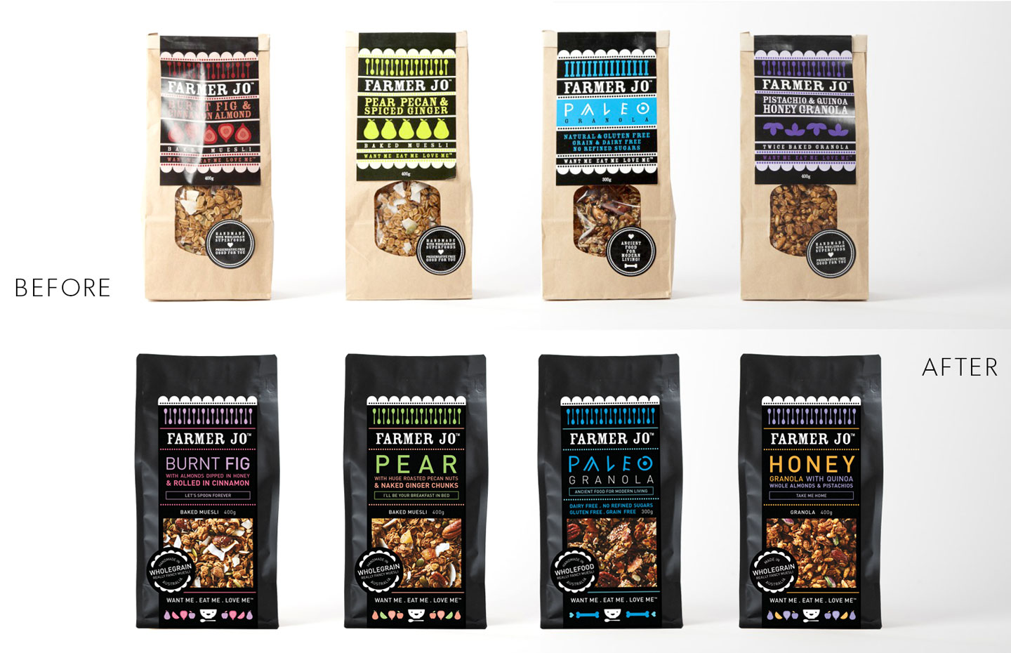
The client was keen to replace their original brown window bag with a black zip lock bag – better shelf life for the muesli, fancier looking product. We commissioned some drool worthy shots from Sydney food photographer legend, Tanya Zouev and said goodbye to the window forever.
A black bag made for coffee beans was chosen and it all rolled on from there.
We focused on the key selling points of the muesli (#1 being its amazeballs delicious) but also standing out from the other mueslis available.
Each flavour has two colours, which means more possible combinations for future flavours and lots of fun colours to work with in their other material (a.k.a social media).
WEBSITE
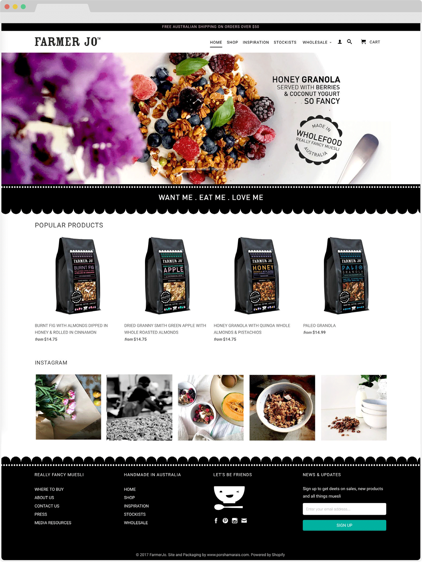
Along with a packaging revamp, this brand really needed to kick its online presence into gear. A major website overhaul happened with an entirely new look site and a big focus on social media.
I made an entirely new site to fit with the brands new look on a shopify platform and as part of an ongoing process, we’re overhauling their social media voice.
ClientFarmer JoSkillsbrand refresh, packaging, web designYear2016