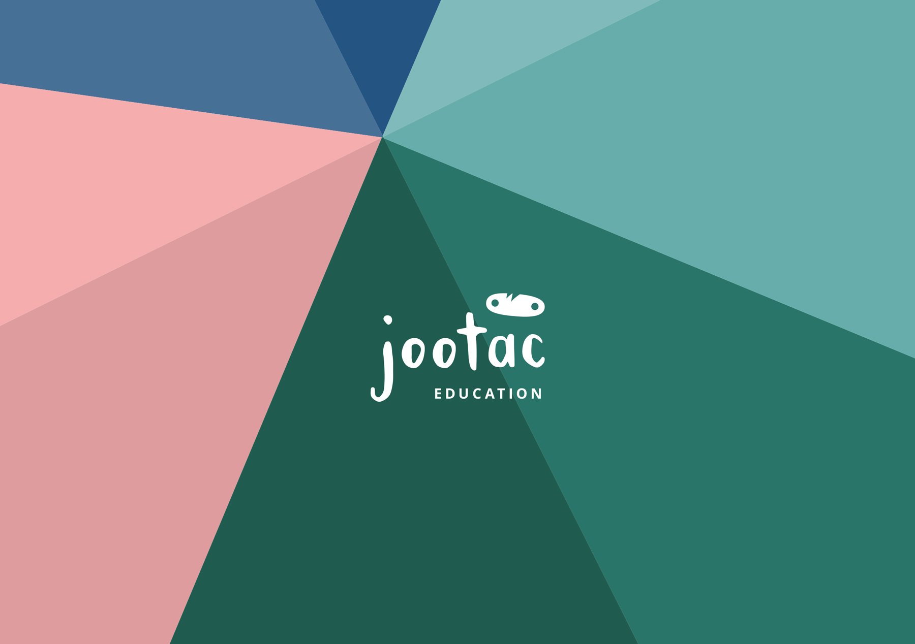
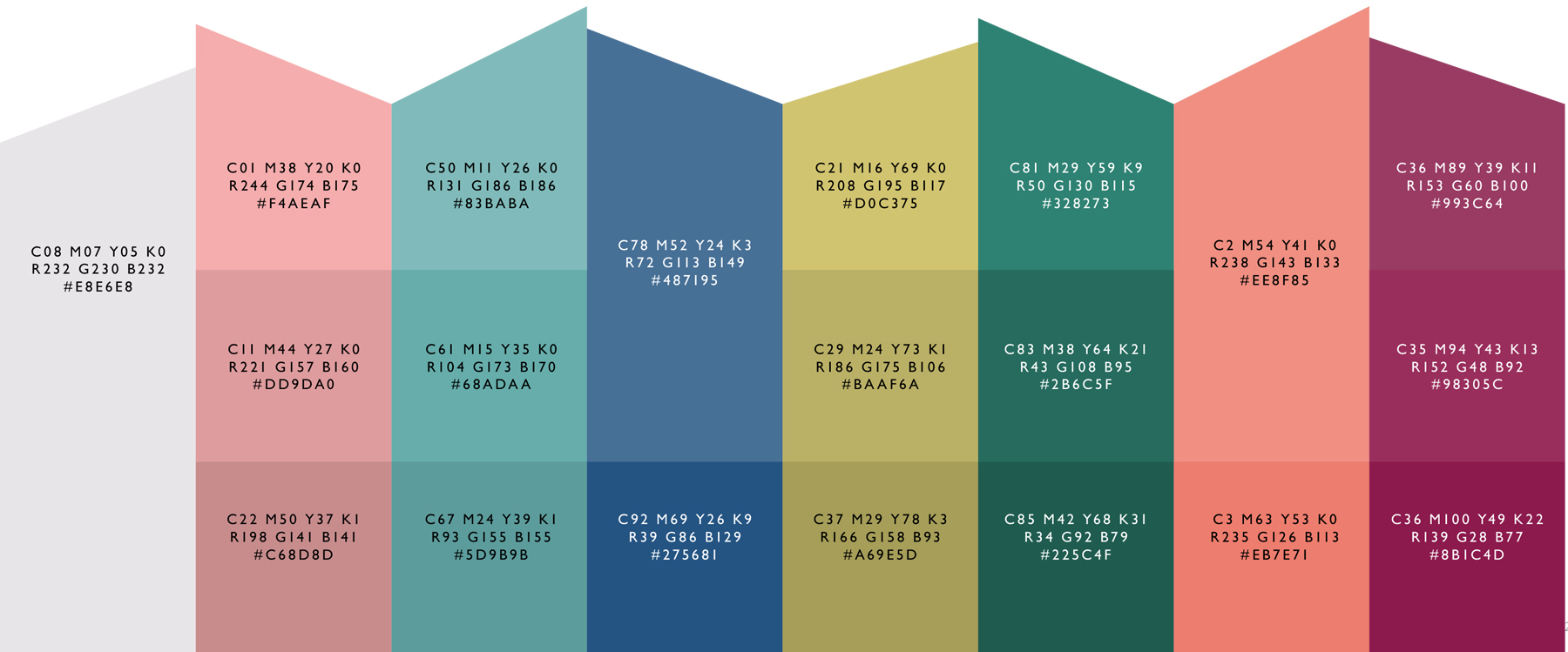
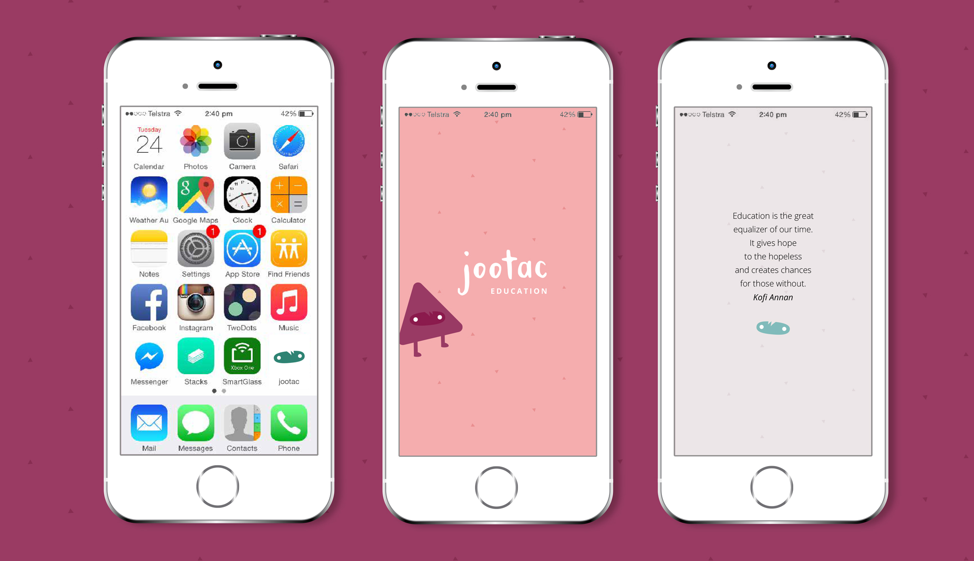
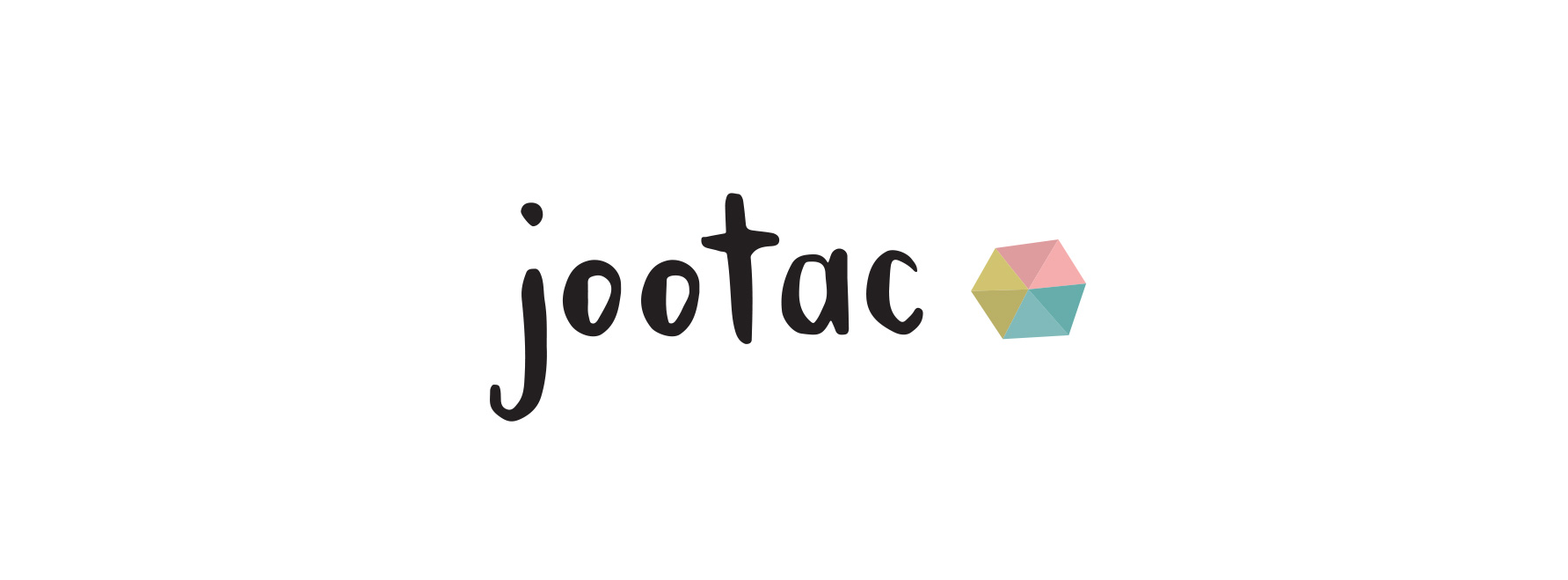
Jootac is an education brand that aims to aid parents in helping their children learn. It is a modern brand that is warm and personalised. Although it is technology based, it is not focused on this. Jootac is focused on learning, improvement and philanthropy.
The jootac brand needed to appeal to a wide age range of all school ages, but most importantly it must appeal to their parents. It is vibrant, multilingual and tastefully fun whilst keeping things simple and not overly childlike.
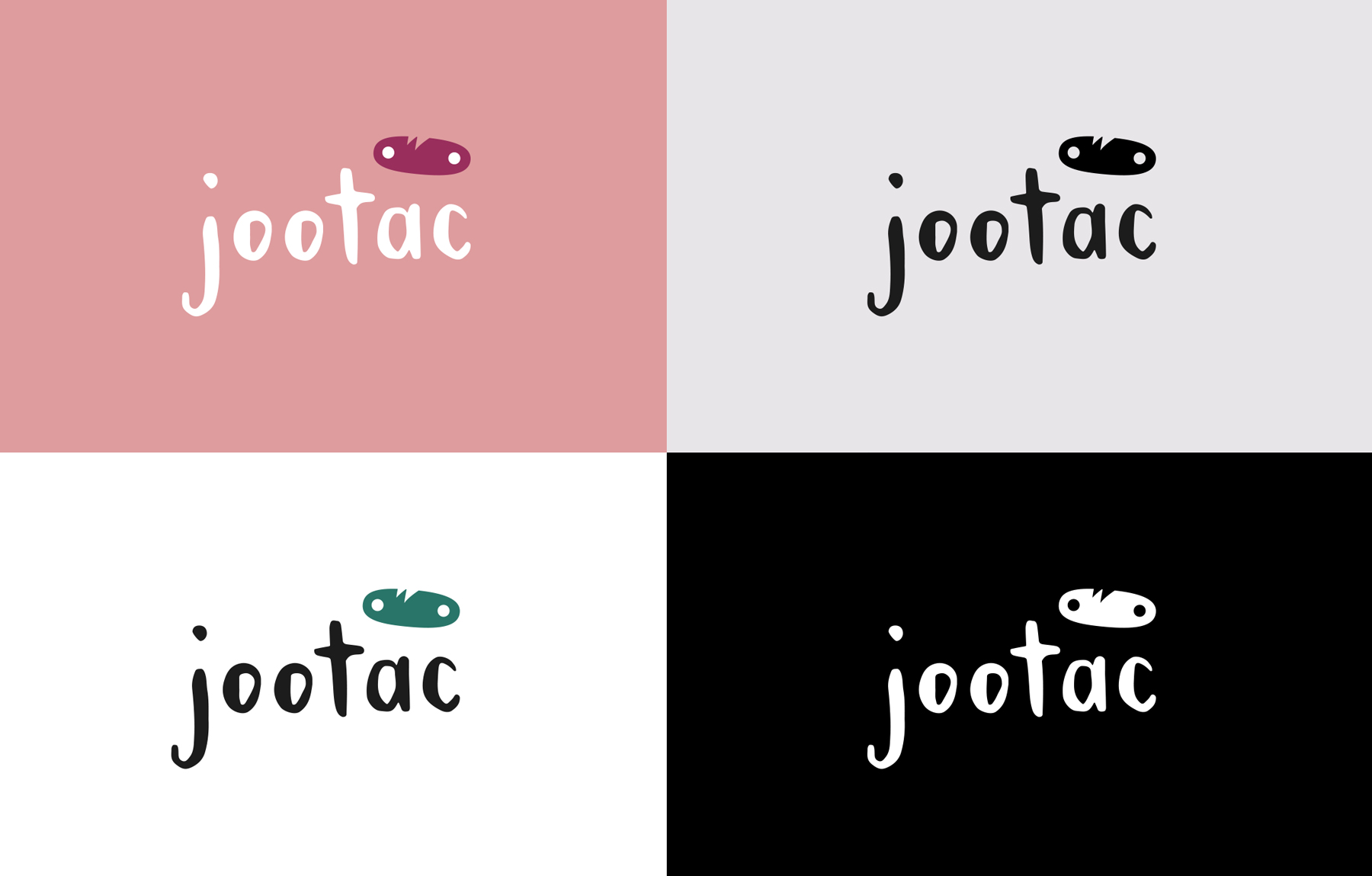
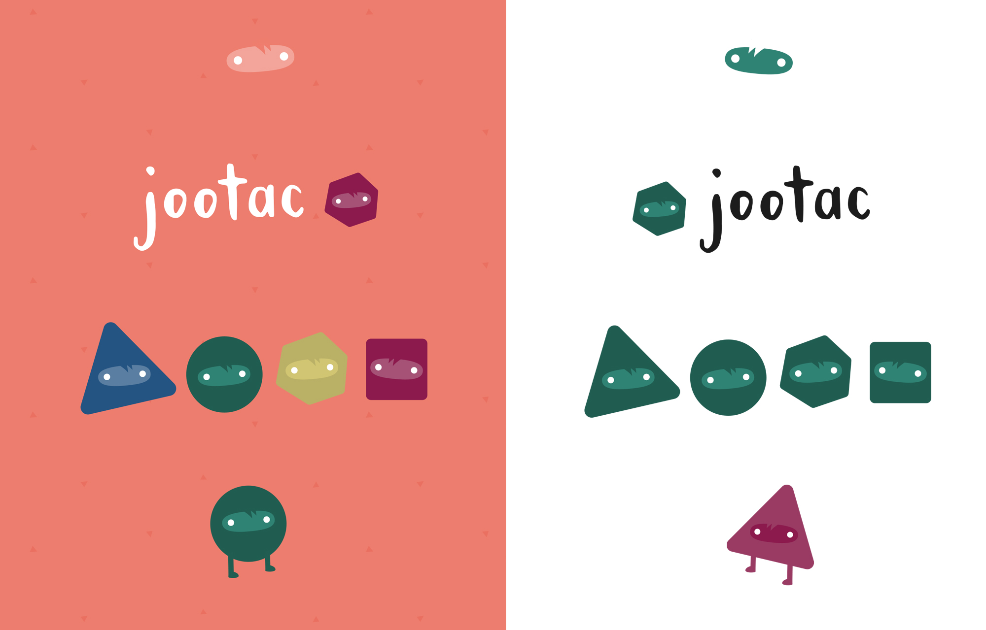
DYNAMIC LITTLE FACE
The brand consist of many elements on top of the logo, including the dynamic eyes (which can be used seperate from the logo type) to add some low-key cute personality to anything. The eyes can also be added to a range of shapes to create mini characters (with optional limbs).
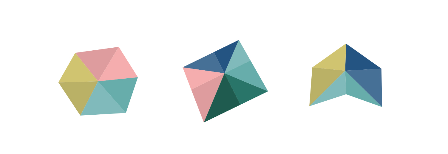
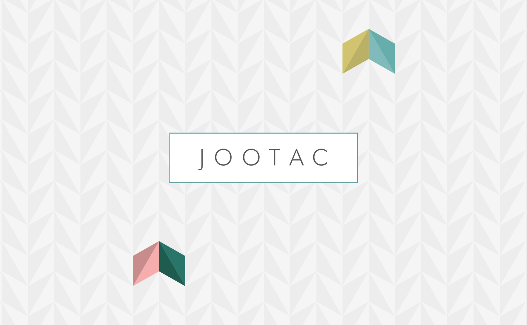
SHAPES MADE OF TRIANGLES
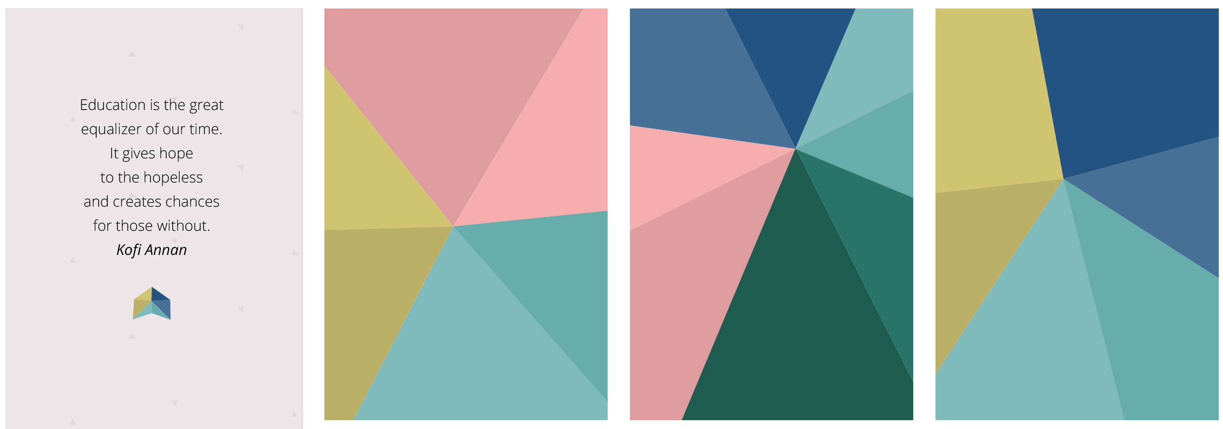
Another element of the brand is shapes made up of triangles (certainly needs a sexier name), usually with pairs of colours in the same tone to give depth. The triangle shapes were the first real brand element for Jootac – as it used to sit next to the logotype before it was replaced by the little face.
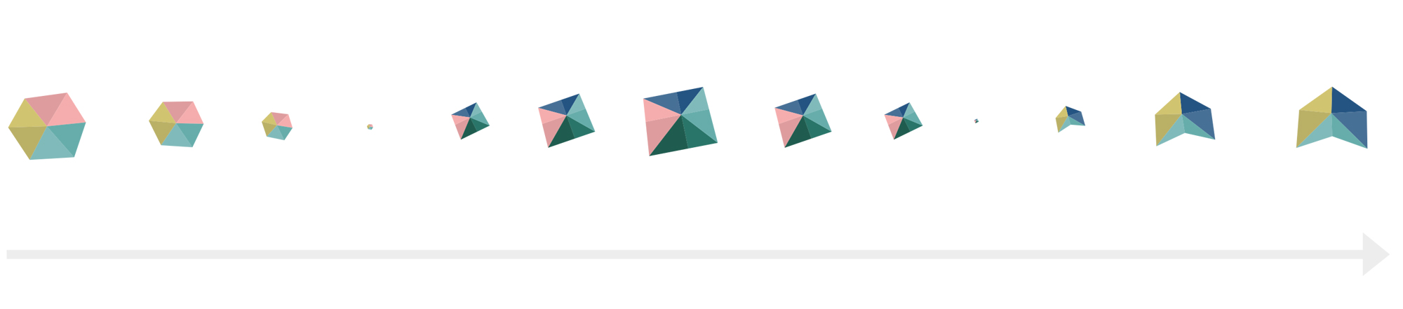
These shapes can also blend into one another – for example in a loading graphic and are used as backgrounds when something more interesting than a flat colour is required.
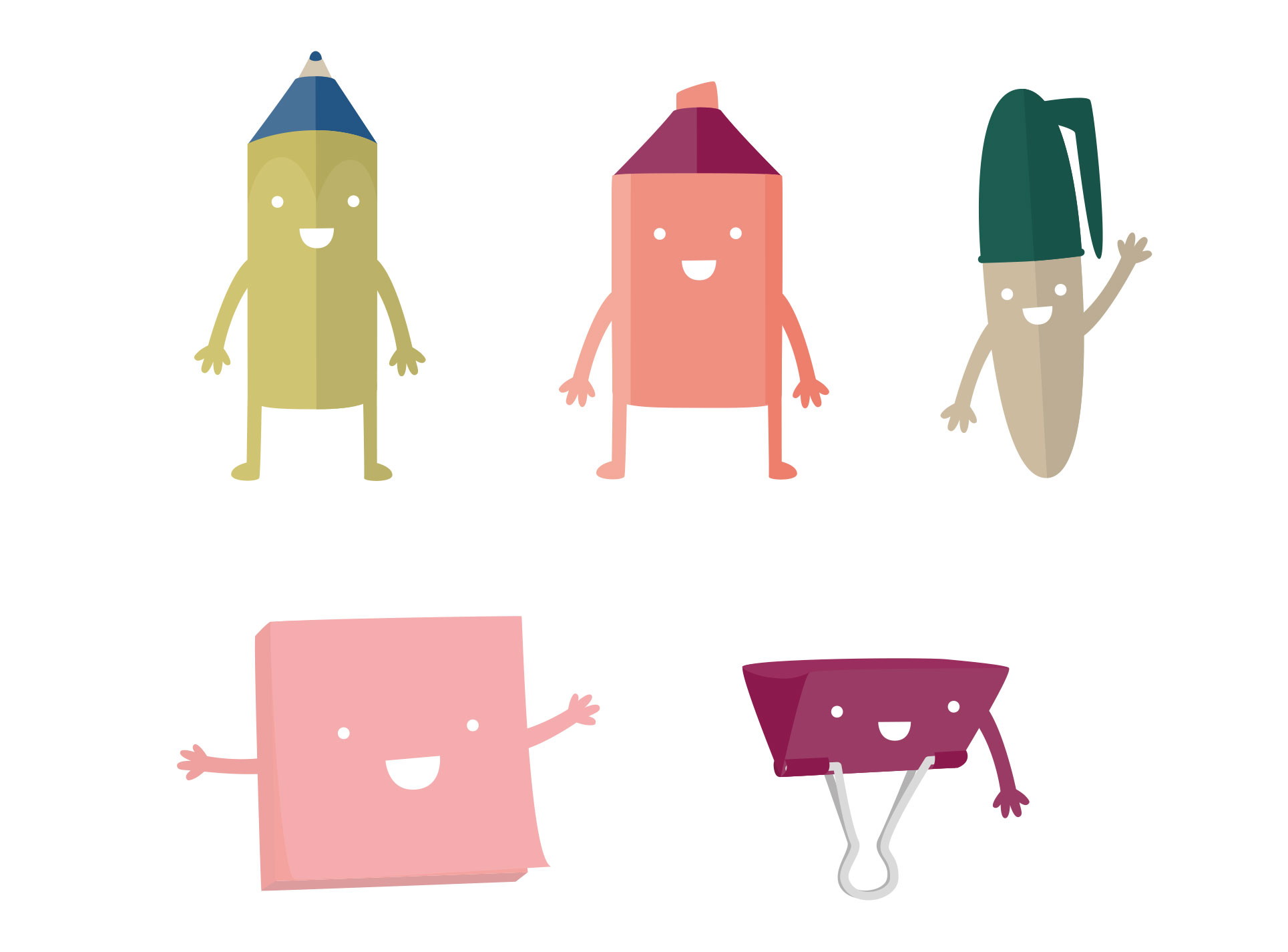
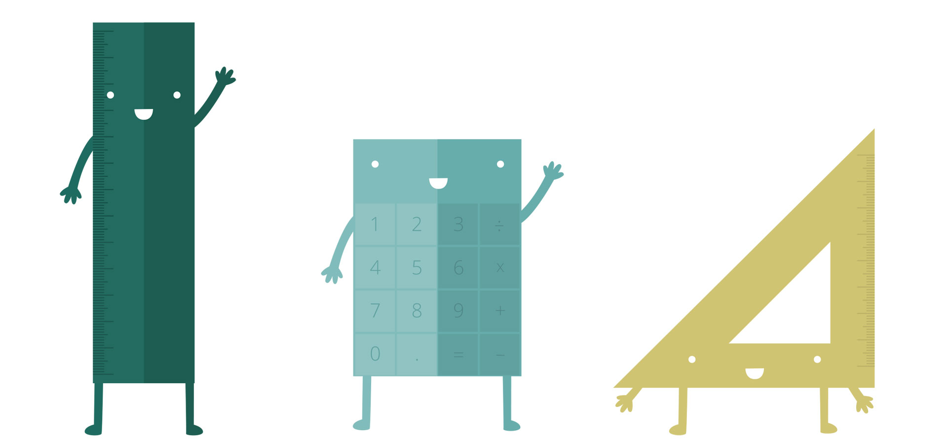
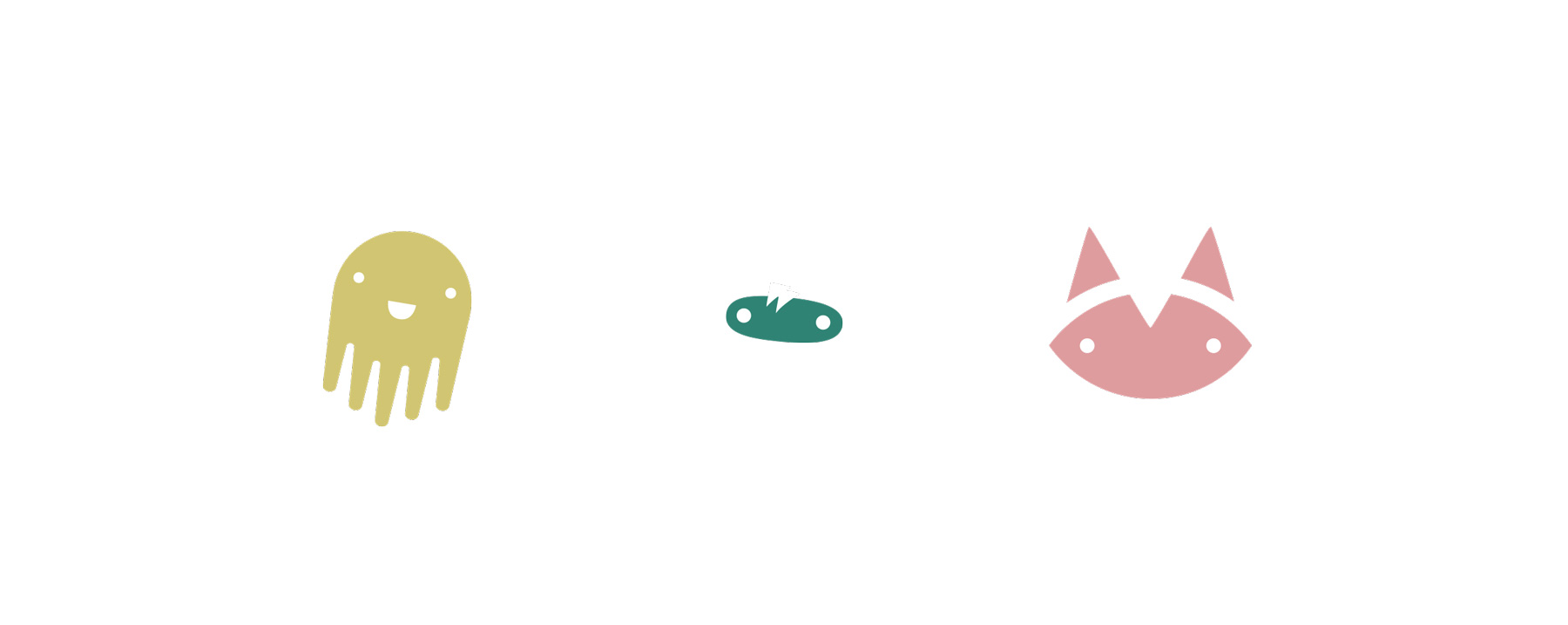
CHARACTERS
Happy, enthusiastic, anthropomorphised math related items are the brands warmest asset. They have no key-lines, are made of the brands colours and can be seen doing things or simply waving. They are little bit naive, and always imperfect but this gives them the charm and relatability that has a wide age appeal.