Kenko Tea is a new Melbourne based brand dedicated to premium quality Japanese Matcha Green Tea. Kenko Tea is on a mission to spread the work about the healthy and tasty Matcha Green Tea – a drink for everyday wellbeing, health and optimal nutrition.
BRANDING
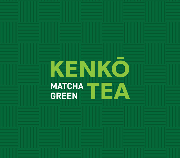
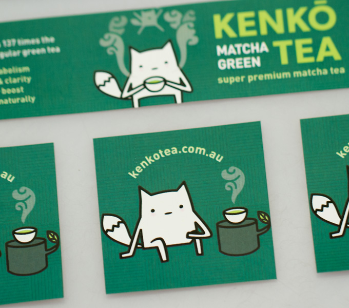
The client wanted the branding to target health conscious females with money to spend on health products, but also with an eye for cool/cute products. The launch product was Matcha Green Tea, but there was a possibility it would branch out into other teas in the future. I helped the client pick a name (Kenko is Japanese for healthy) and went with the rather obvious colour palette of green. I also added a tatami mat pattern to stop the greens from feeling to flat.
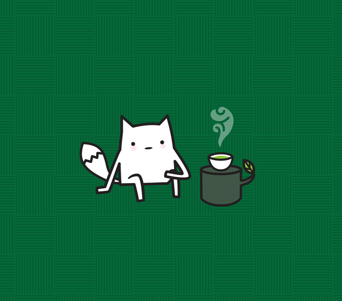
The client really wanted a healthy and cute mascot that his customers could identify with, so I created a cute ambiguous creature that looks a little bit like a fox. I felt it wasn’t so important that he looked like any particular animal, but more that he was happy, healthy and cute (top of the list).
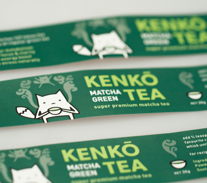
PACKAGING
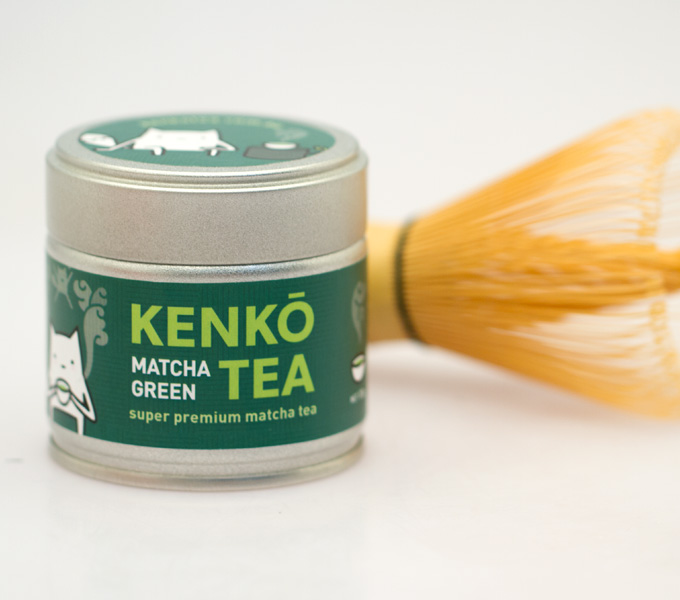
The packaging was a simple wrap sticker that the client printed himself and put onto the tins. It needed to look great whilst being printable in-house in small quantities. All the branding elements were utilised and a minimal amount of information was put onto the sticker to allow for space and a big mascot. The client was stoked with his end result and his customers are commenting on his great product and cute packaging.
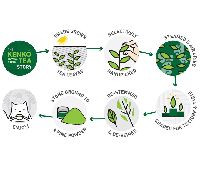
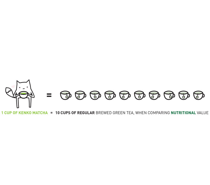
DIAGRAMS
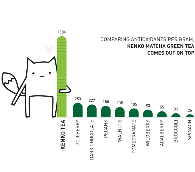
After seeing the Pana Chocolate “how its made” diagram, Kenko wanted some similar engaging diagrams for their own site. Two diagrams were made to convey key marketing information on the product to match with the brand. I particularly like the bar graph with the little mascot hugging the overwhelming winner – matcha green tea.
If you are interesting in purchasing some Kenko Tea, you can buy online at kenkotea.com.au