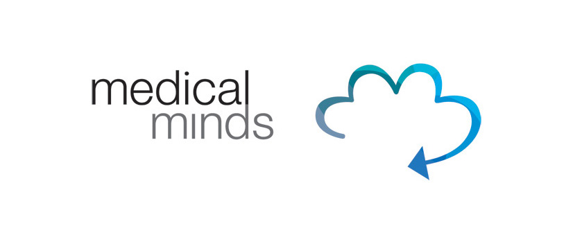
Medical Minds is a medical liason that represents Cardiologists and Neurosurgeons.
BRANDING
I wanted to work the heart and brain together, without using the cliche medical symbology that dominates this area. I worked in two subtle heart shapes into a brain outline. The arrow symbolises how the business can help you move/develop your own practice, as well as symbolising progress.
The client loved the logo and the array of colours in the logo. He also loved that it was so many things – hearts, a brain, progress and the company monogram of MM.
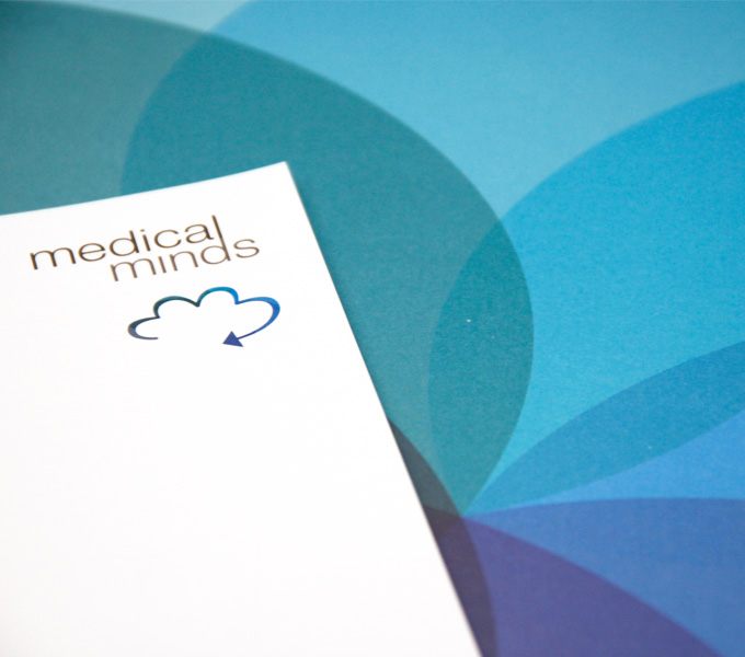
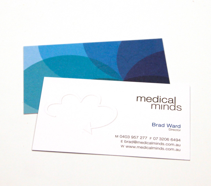
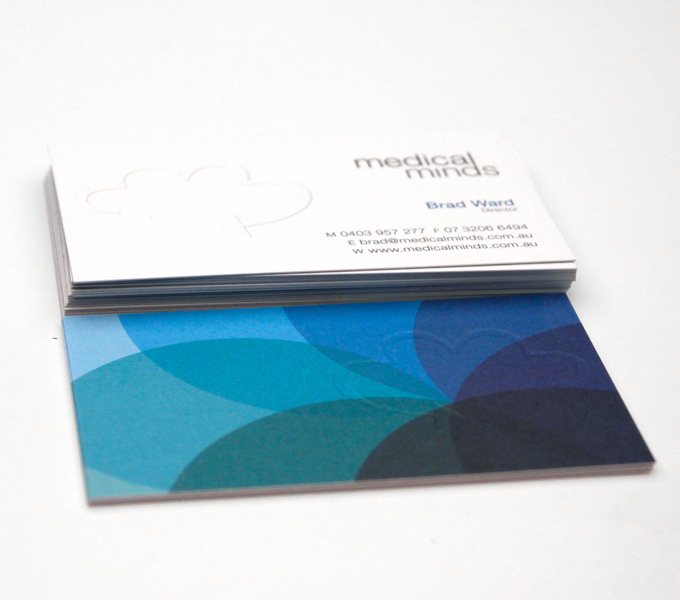
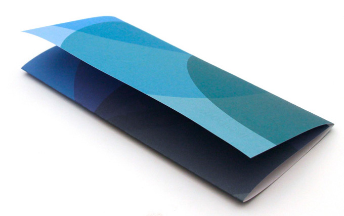
BUSINESS CARDS & LETTERHEAD
4 colour process on 2 sides with custom emboss (cards only). cards printed on 350gsm K.W.Doggett Knight White Smooth. letterhead printed on 120gsm
The client was after stationery that looked and felt like quality. The smooth velvet feel of the uncoated paper with the embossed logo gave the receiver a tactile feeling of quality, whilst the vivid blue patterning on the back made it stand out from far away.
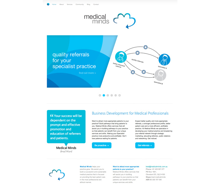
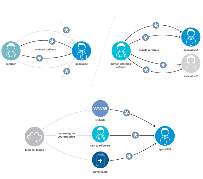
WEBSITE
The client was after a simple information website that they could easily edit themselves so this website was built using wordpress. Although a rather simple site, this one came with the challenge of explaining the clients new & complicated service through diagrams. It took a bit of bringing-things-back-to-basics, but in the end the client was super happy and felt the explanations summed up his service to a tee.