Pana Chocolate is an Melbourne based raw, organic, handmade chocolate which launched in 2011 as a luxury chocolate. I worked closely with Pana Chocolate from 2010 to 2014 on all aspects of their brand, seeing them from launch to international recognition.
BRANDING
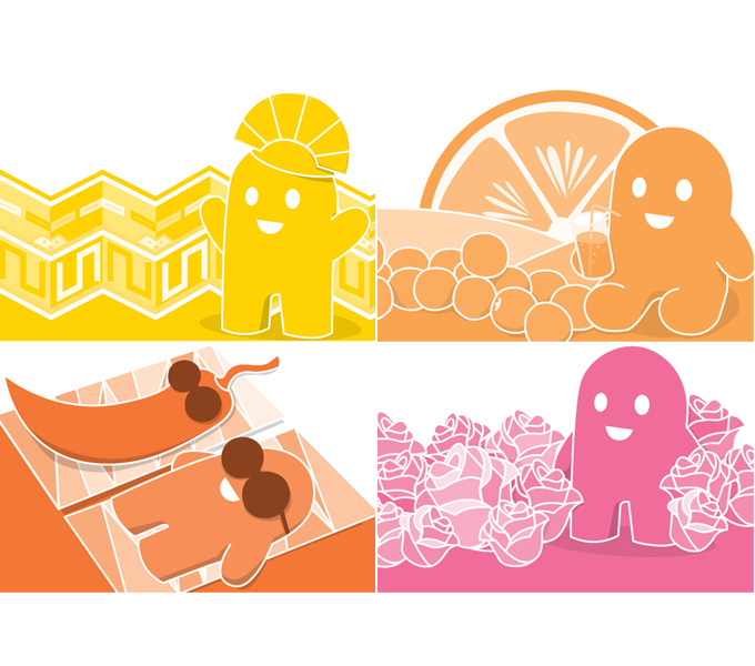
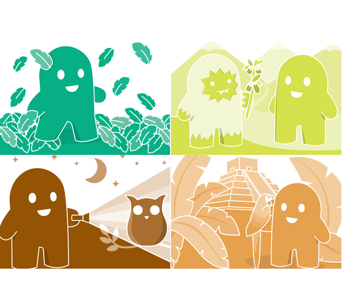
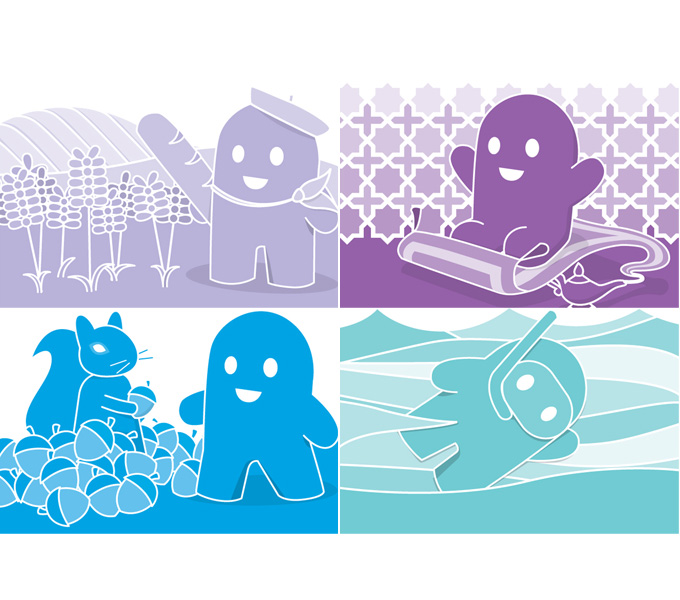
More than just a logo, the brand identity needed to convey the ethos of the chocolate makers and appeal to their target marget. A simple modern logo fitted with what the clients were after for the luxury market, but the personality really came out in the packaging and character design associated with each of their flavours. The brands mascot character represents the brands beleifs – happiness through health and a love and appreciation of nature.
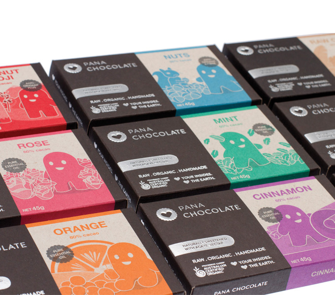
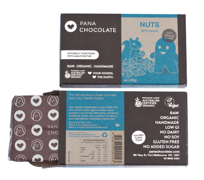
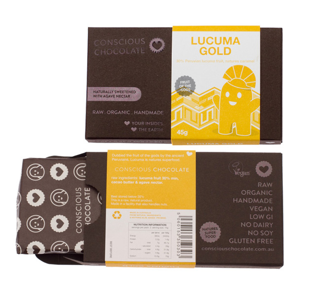
To fit with the companies ethos “heart your insides, heart the earth”, the packaging was designed to be eco friendly – recyclable foil, soy based pantone inks, 100% recycled board – the result is a very rough, organic feel which the client (and their clients) adore. The aim was to design packaging for the chocolate that drew the right people to it, but also to make people outside of their usual market want to try it purely because they loved the packaging.
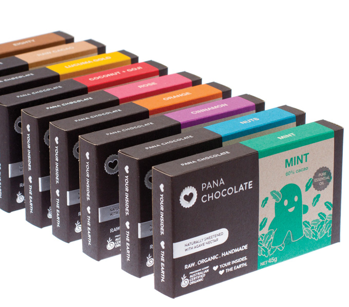
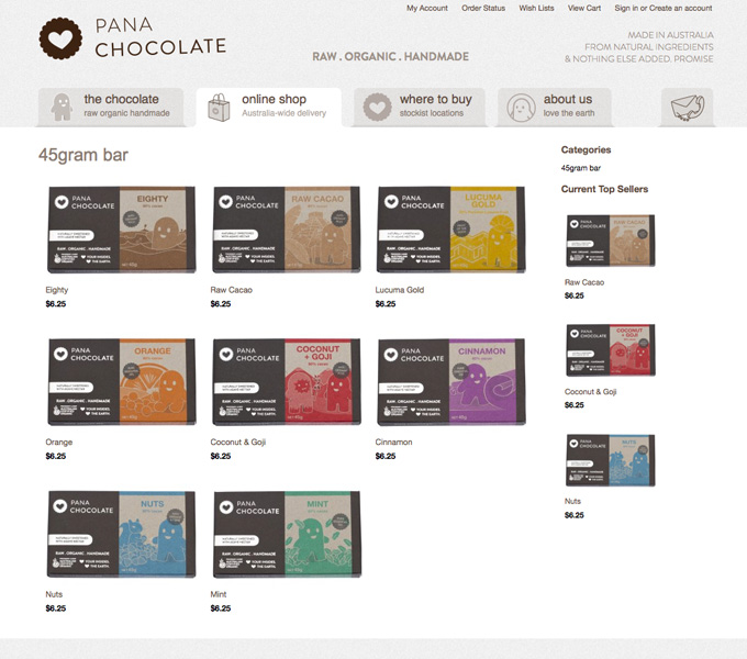
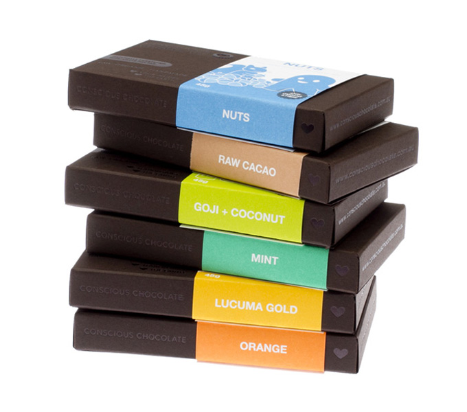
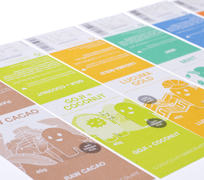
The chocolate makes the most of all natural ingredients, so it was intended the flavour / colour range would draw the best and brightest colours from nature also. Each flavour has a unique coloured strip (PMS) with its own quirky character illustration representing the flavour inside. The packaging is printed in 3 colour (brown, black and the flavours unique PMS), so the drawings needed to work in tones of its represented colour. As a start, the company launched 9 flavours, with plans to expand the range in the future. A colour plan was devised from the beginning, so new flavours would simply expand the rainbow with the basics being represented by the browns.
All concept and design by me, including logo and branding, character illustration, box concept and design.
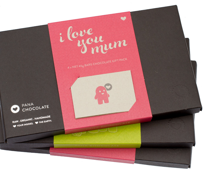
In 2013, Pana Chocolate decided to add special occasion gift boxes to their range. The series started with Happy Easter and I love you mum, with more occasions to be added to the range later on. The gift box was based off a large version of the original 45g bar, with a brown box and bright coloured sleeve. It also included a gift card that tucked into the sleeve on the front. The box was foiled with silver and embossed. As with all Pana Chocolate packaging, the box was printed with soy based pantone inks on 100% recycled board and used recyclable foil.
WEBSITE
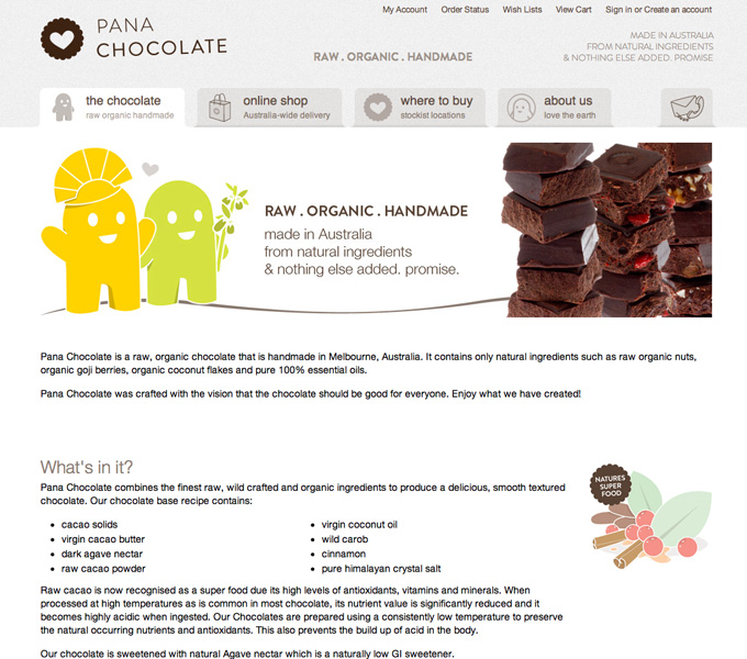
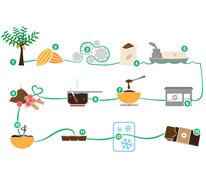
The shopping cart website was constructed using a bigcommerce base. The structure of the site was kept as simple and upfront as possible to keep with the brands ethos – but it still had to be very informative. Explanatory diagrams (about the manufacturing process) and google maps (for stockists locations) were used to convey large amounts of key info in an easy to digest way for the viewers.
RENAME
Due to a mountain of complicated legal reasons, in 2012 the company changed name from Conscious Chocolate to Pana Chocolate. It was the clients intention to keep everything as similar as possible to the previous look.