BRANDING
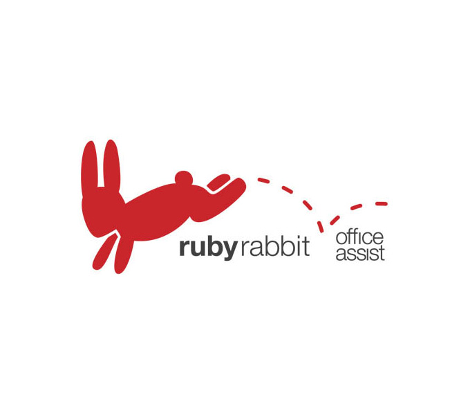
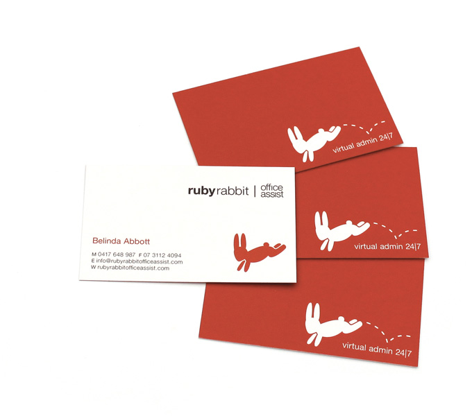
The owner wanted a name that dedicated the business to her daughter, Ruby Abbott, as she started her own business to spend more time with her at home. The rabbit was a natural progression from her name and also created a nice mental image of busy, energetic rabbits getting through the admin work quickly. The rabbit in the logo was designed to appear in motion, rather then stationary. The client was extremely happy with the name and the logo.
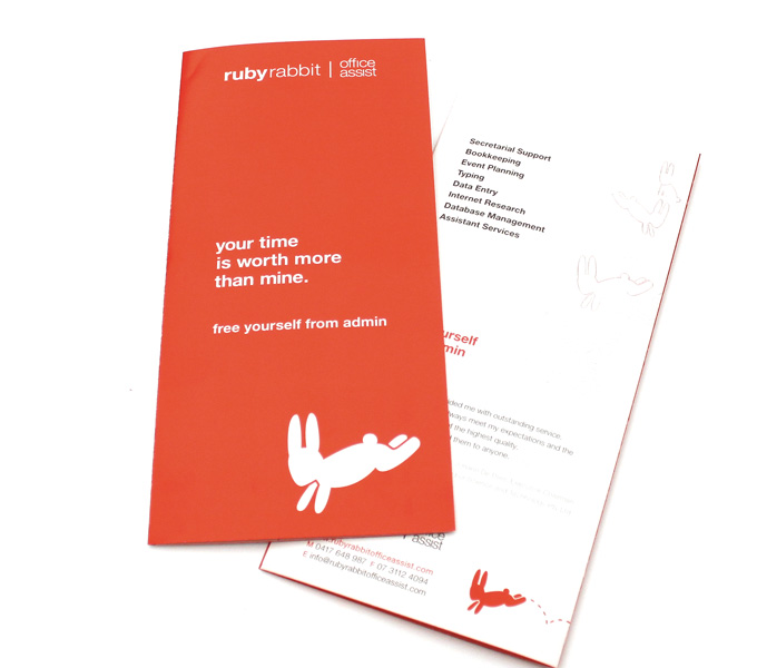
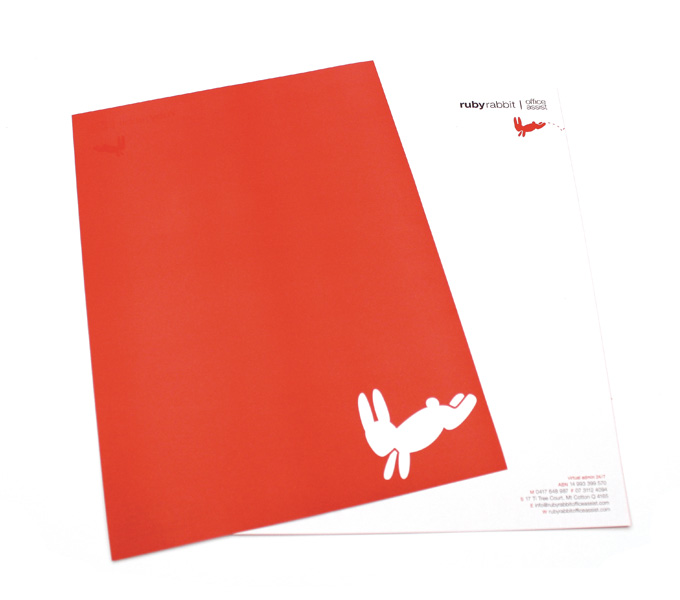
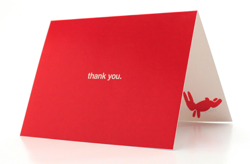
STATIONERY & BROCHURE
2 colour print (PMS red + process black)
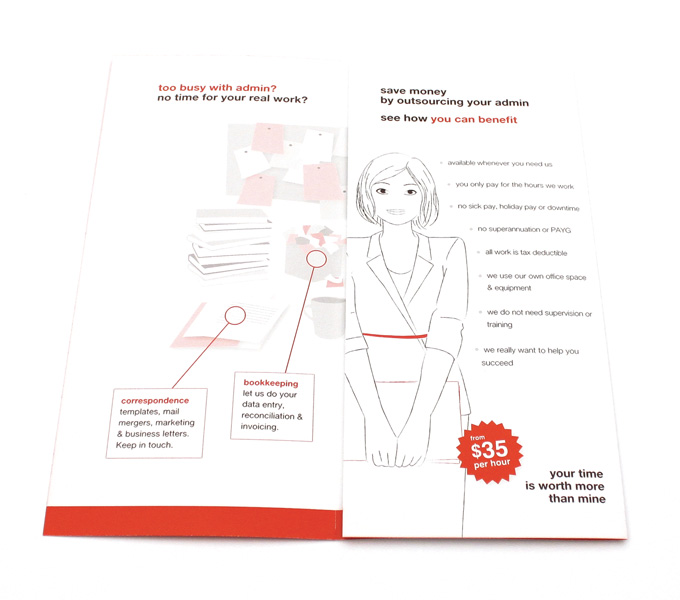
The brief was to design a DL brochure for use in PO Box drops to generate new customers for the client & to explain their services clearly. Using a 2 colour palette, the brochure was simplified to a couple of simple bullet-point lists and a large explosion diagram explaining how the services could benefit any office. The short & direct cover tagline was designed to attract the viewer’s attention quickly and hopefully stop them from throwing it away.
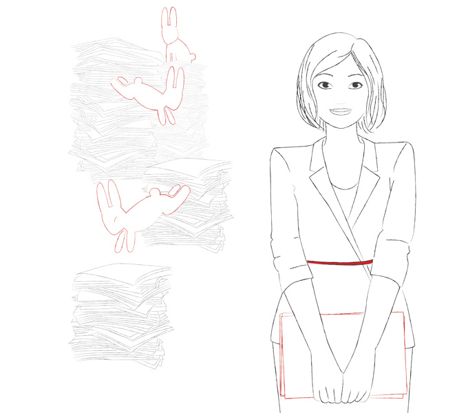
ILLUSTRATIONS
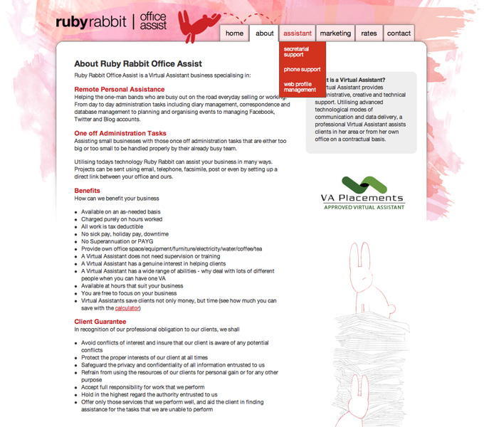
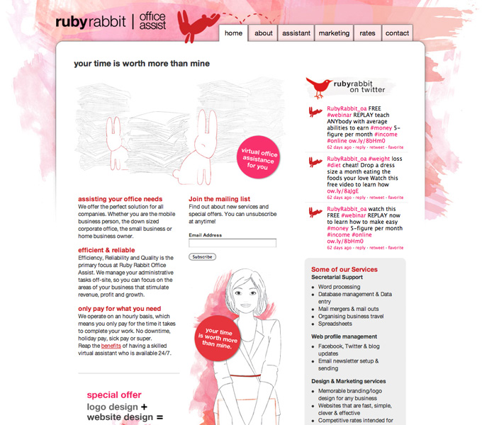
The client liked the idea of illustrations to replace photographs as their business was at home and they were not fond of their photo being taken. The rabbits being productive with paper gave a nice mental image of what the client does, without using generic stock images. Illustrations were created of the client and busy rabbits and used throughout the website and marketing material. A blow-out illustration of the work environment where the clinet’s services could be applied was also created for the brochure.
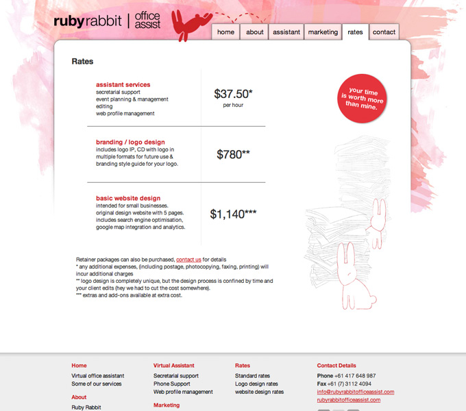
WEBSITE
a website for an emerging business to generate new clients and explain their broad range of service. It must be fun and not resemble a corporate template like their competitors. The website needed to have a lot of lists and information as the genre of the clients business was new and her service list was detailed. To break up these big chunks of text, cute illustrations of rabbits going through paperwork were created. A watercolour background also aided the youthful corporate feel. In 2010, the site went through a re-design to accomodate new services and inegrate social media. It also received a subtle cosmetic makeover.