STASH are artisanal coffee bean roasters from Denmark, Western Australia. They came to me to establish a look for their brand and create a set of stickers to label their packaging.
BRANDING
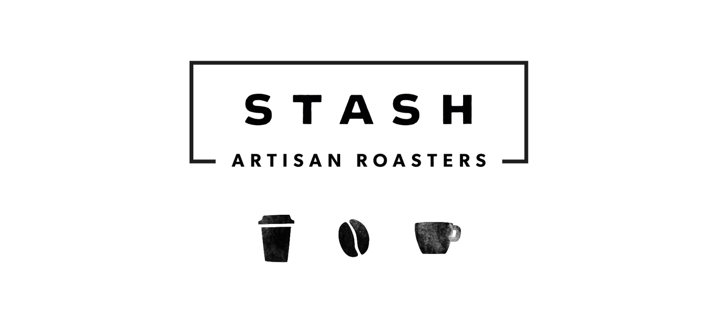
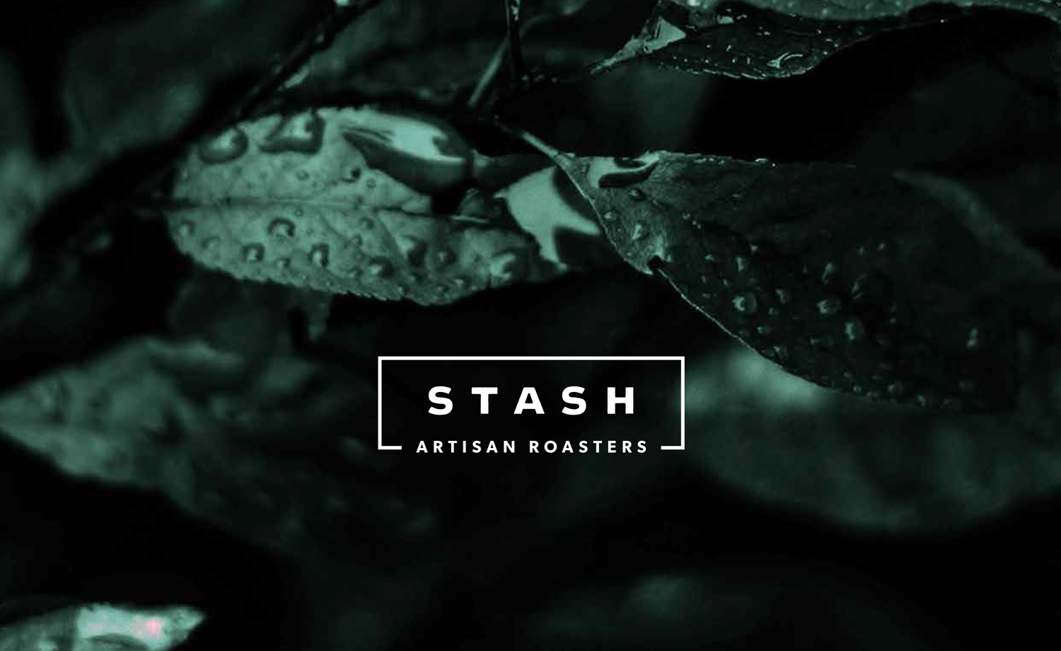
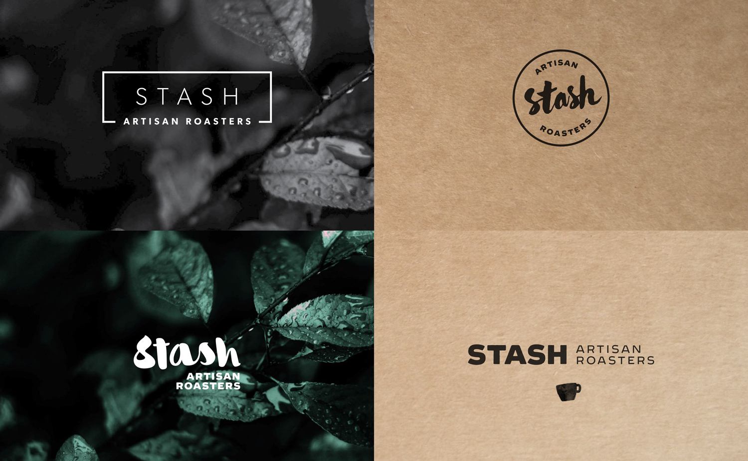
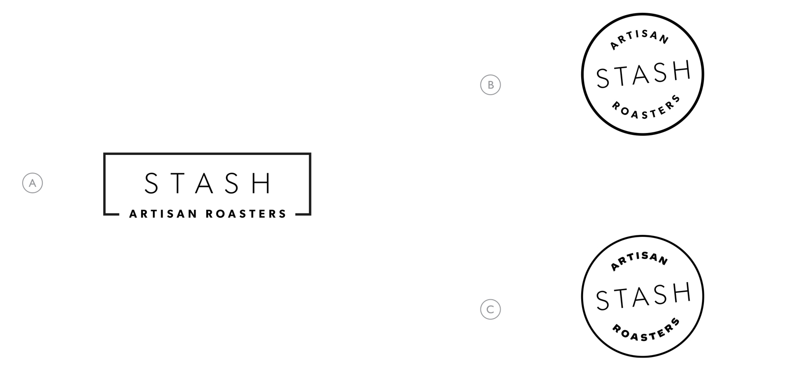
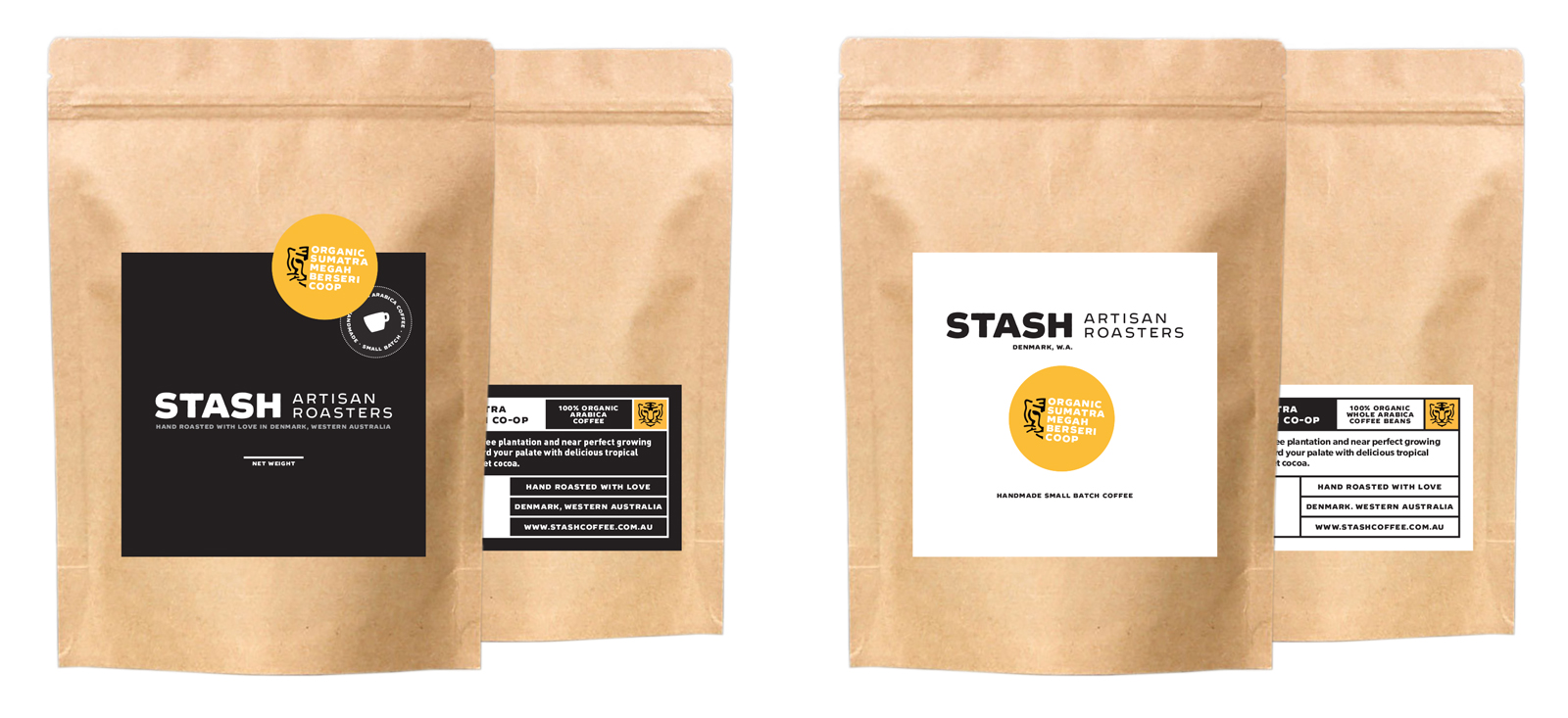
With a focus on keywords like handcrafted, quality and eco conscious, I created a look for STASH that focused on minimal graphics with minor touches of texture. The name STASH references a cache or secret hoard of some excellent coffee (like a local secret), so I wanted to incorporate a container into the brand. The logo went through a few iterations during the development process of the brand, even whilst the packaging was being decided, but the final version with the rectangle has great recognition in all sizes and fits with the minimal look the client was after.
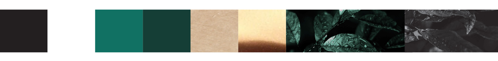
The client really wanted a mostly monochrome palette, but I complimented this with some dark greens of coffee leaves to keep things fresh. I chose green because its an uncommon colour in the roasting industry and references the eco-conscious, socially aware nature of the brand. From the start, STASH knew they would use kraft brown bags for their beans – so I incorporated this as a major part of the brand. Textures convey the small batch, hand crafted message better than flat colours ever will… for this reason STASH’s branding included a myriad of textures – Kraft paper, gold foil, very dark moody photos of leaves in the bands colour palette.
PACKAGING
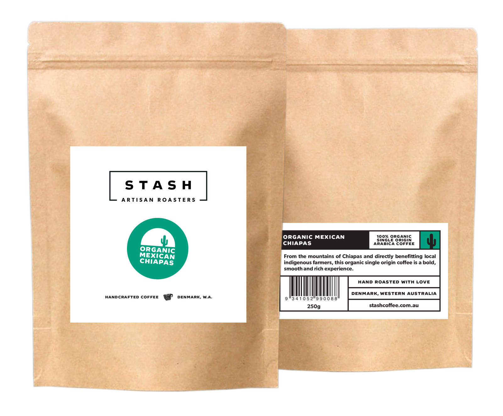
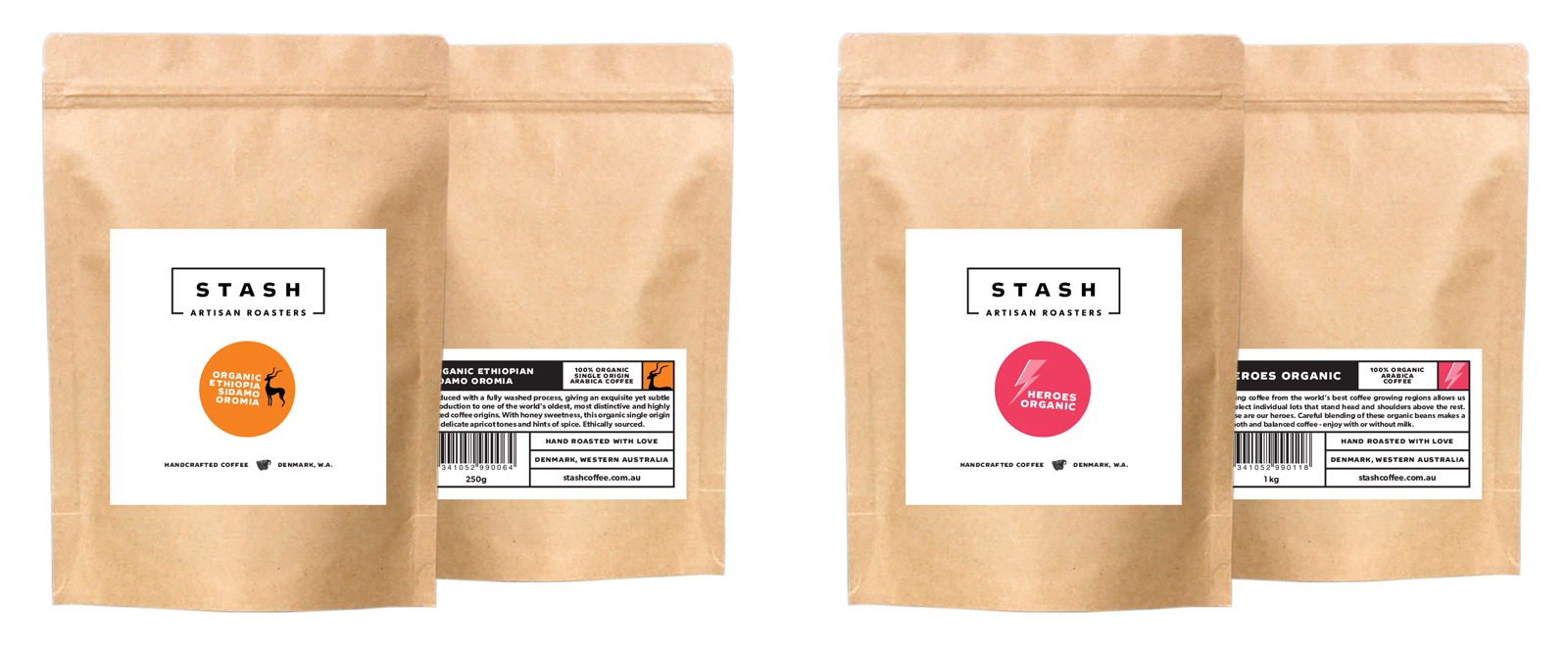
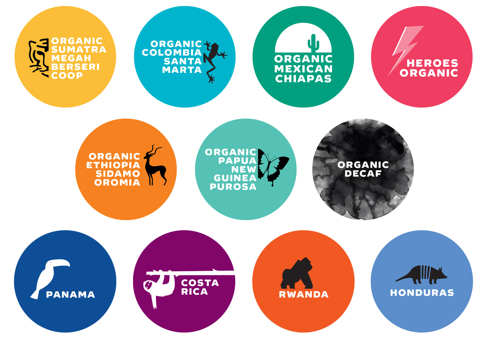
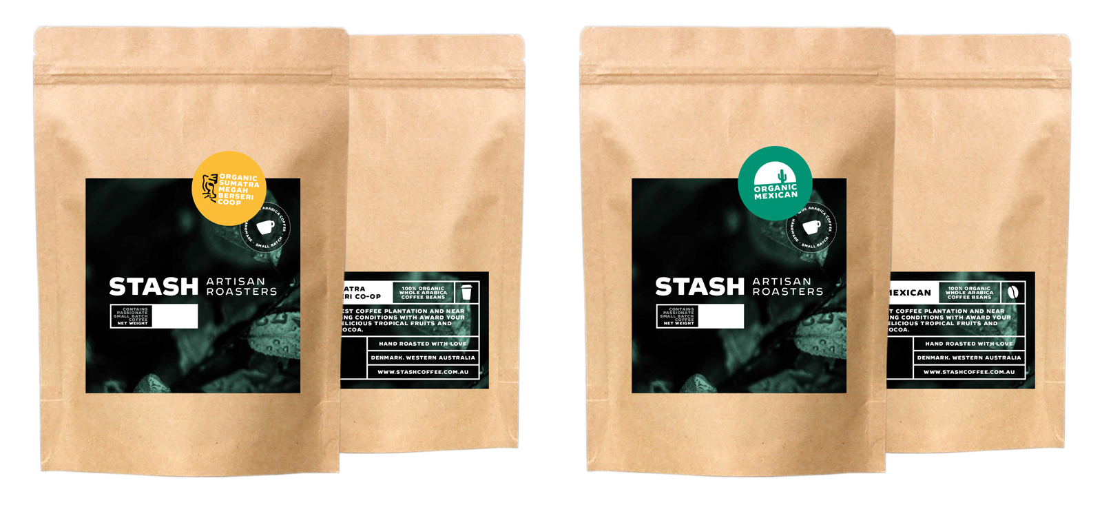
The STASH packaging system needed to be fluid and work with a number of bean blends and bag sizes. I designed a system that had a universal brand sticker with smaller stickers for each blends tasting notes.
As the brand is quite monochrome, the client loved the idea that the blend stickers would be bright and colourful. I designed an organic (plants or animals) based symbol for each blend – all except the house signature blend ‘Heroes’, named after the Bowie song, so it required a reference to the music legend. Each blend has a detailed ‘tasting notes’ sticker for the back of the bag, which holds all the details so that the front can be minimal and breath.